In this exercise, you'll learn how to populate a template representing a project overview. This template will be generated using Xporter Reports, without using an issue context, having a JQL iteration and pivot tables with charts.
This template is going to be an Excel report.
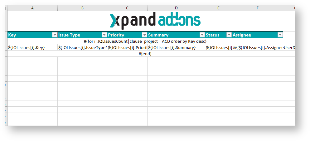
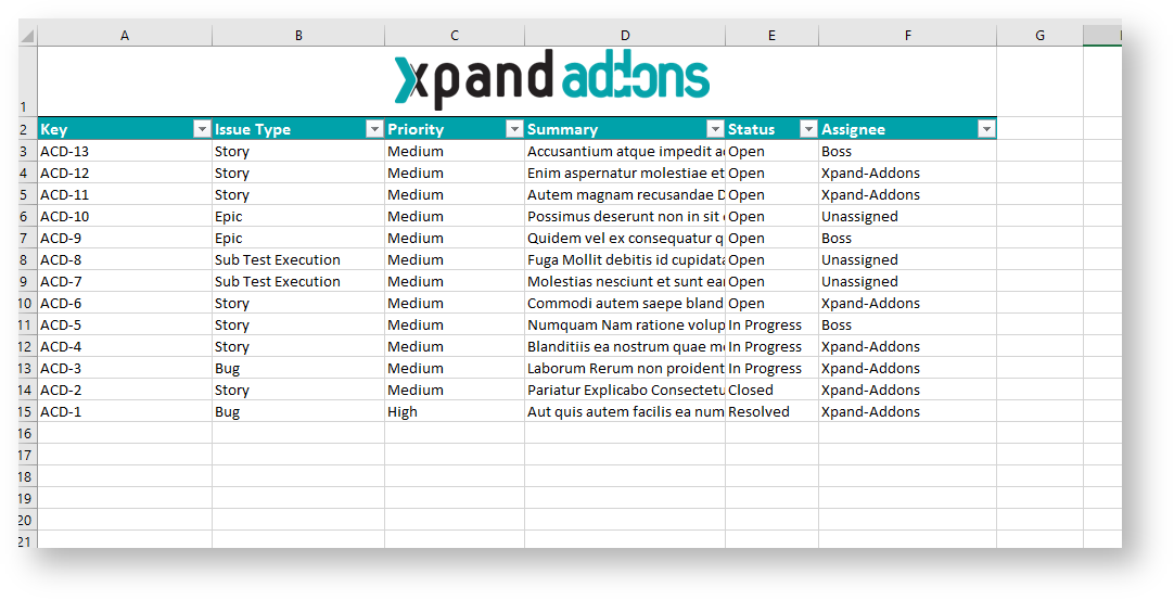
Let's create the first sheet. Name it Issues and create a table header with 6 columns:
| Key | Issue Type | Priority | Summary | Status | Assignee |
|---|
Create the iteration #{for i=JQLIssuesCount|clause=project = ACD order by Key desc} below the table header.
As we're using an Excel template, don't forget the following note:
Using an XLSX template, please take note that to define an iteration for multiple columns, you need to merge a row of columns and define the #{for i=JQLIssuesCount...} inside those merged cells. The same thing should be made to define the #{end} of the same iteration. All content between the #{for i=JQLIssuesCount...} definition and the #{end} will be duplicated for each iteration.
Populate the iteration with the placeholders correspondent to the table header:
| ${JQLIssues[i].Key} | ${JQLIssues[i].IssueTypeName} | ${JQLIssues[i].Priority} | ${JQLIssues[i].Summary} | ${JQLIssues[i].Status} | %{'${JQLIssues[i].AssigneeUserDisplayName}'.length > 0 ? '${JQLIssues[i].AssigneeUserDisplayName}' : 'Unassigned'} |
If the issue has no assigned user, we're printing 'Unassigned', as the default is being printed blank.
Finally, close the statement using the mapping #{end}.
Well, the first sheet is complete. From here onward, will be creating pivot tables from this table.
A pivot table allows you to extract the significance from a large, detailed dataset.
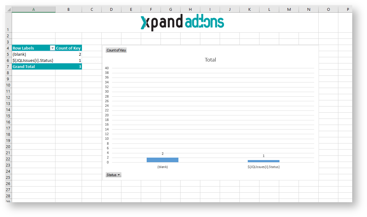
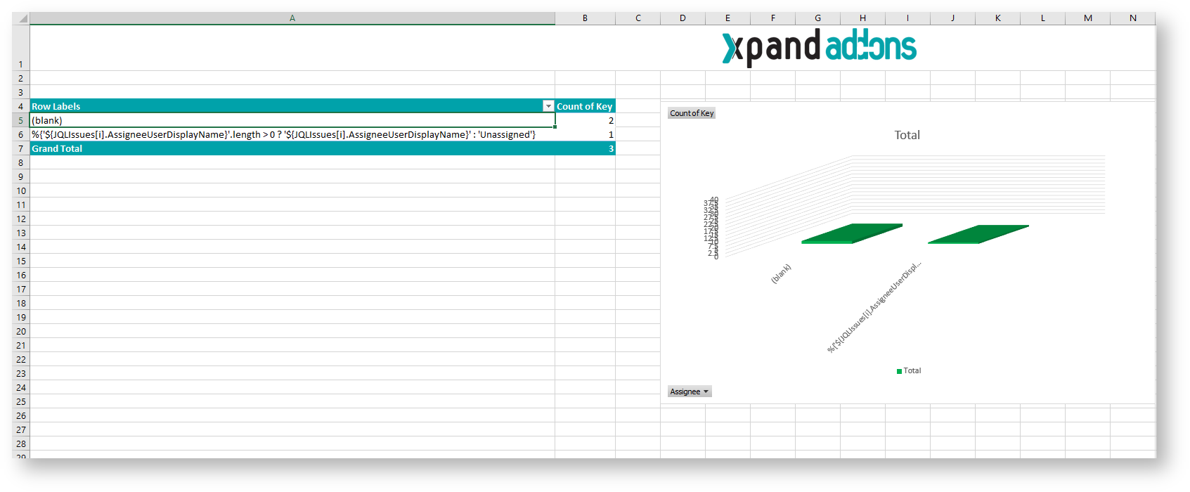
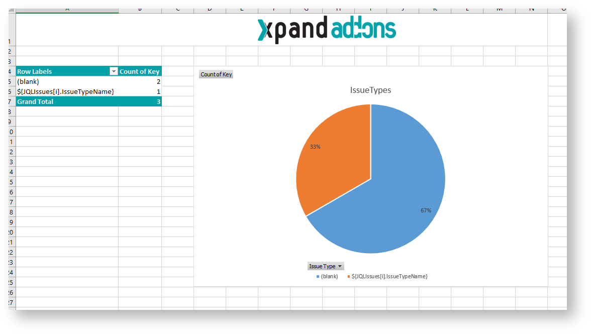
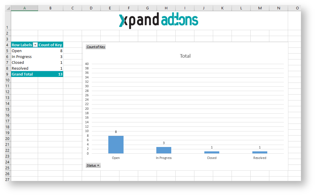
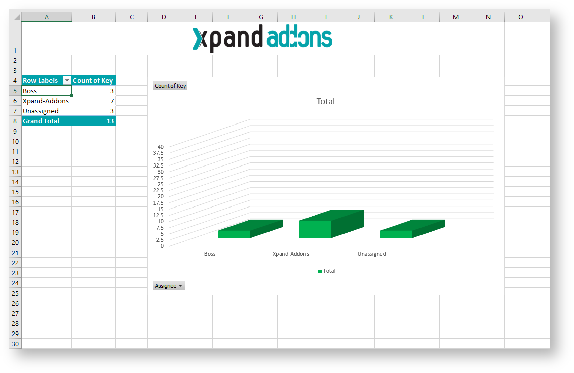
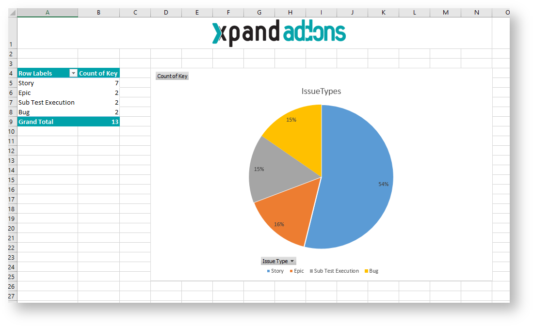
Create sheet for Chart by Issue Type:
- To create a pivot table click on the first cell inside the header. (cell with "Key").
- On the Insert tab, click PivotTable
- A Dialog box appears. Excel automatically selects the data for you. The default location for a new pivot table is the New Worksheet.
- Click ok. The second sheet was created.
Now, The PivotTable fields list appears.
- The Field Issue Type we are going to drag on the Rows.
- Key we are going to drag on the Values.
Refresh the pivot table data:
- Right-click the pivot table and select PivotTable Options
- Select tab Data
- Check Refresh data when opening the file.
In order to pivot tables being well populated with Xporter data, it's needed to configure them to reload the data when opening the exported file.
Note: this affects all Pivot Tables, When you have multiple, you'll only need to apply to one of them.
The configuration of the pivot table is done but you are going to add a chart.
- Select all pivot table.
- On the Insert tab, click charts. You can pick up all chart. In this case, I am going to choose the 2-D Pie.
- The chart appears on the sheet.
Well, the second sheet is complete. Rename it to "Chart by Issue Type".
Repeat the previous steps for each of the following charts:
- Chart by Status (use a 2-D Column chart)
- Chart by Assignee (use a 3-D Column chart)
This type of report is populated from a JQLIssuesIteration. This means it doesn't need an issue/bulk context to be exported. It can be exported straight from the Xporter Reports on the top bat of your Jira instance.
Please take note that when uploading your template you need Xporter Reports selected in the Scopes section.
Below there is a sample of how the mappings will be displayed in the template:
 |  |
 |  |
Below there is a sample of how the generated file will be populated:
 |  |
 |  |
If you like this exercise, please share your opinion on the page by just leaving a comment or a ![]() . Your opinion is very important to us.
. Your opinion is very important to us.
Thank you in advance.
Enjoy our product. ![]()