In this exercise, you'll learn how to populate the Issue time taking from some issues with pivot tables on an Xporter-generated file.
This template is going to have four sheets.
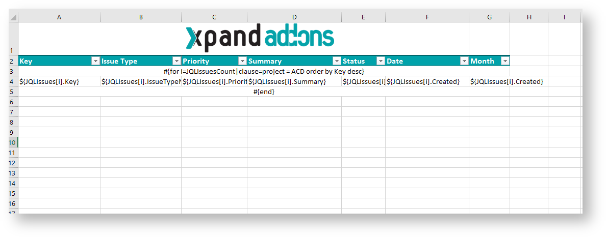
Let's go to create the first sheet whose name can be "Issues", If you want to display the header you must create the Header using a table with 7 columns and 1 row:
| Key | Issue Type | Priority | Summary | Status | Date | Month |
|---|
Since all the table contents below the Header are dynamic, firstly we need to create a single row Table to be the Header, and below it, add the #{for i=JQLIssuesCount|clause=project = ACD order by Key desc} statement, so the Header is printed only one time.
On this case is a template on Excel, so don't forget the note below.
Using an XLS template, please take note that to define an iteration for multiple columns, you need to merge a row of columns and define the #{for i=JQLIssuesCount...} inside those merged cells. The same thing should be made to define the #{end} of the same iteration. All content between the #{for i=JQLIssuesCount...} definition and the #{end} will be duplicated for each iteration.
With that done, create another row table where the Issue Comments will be populated:
| ${JQLIssues[i].Key} | ${JQLIssues[i].IssueTypeName} | ${JQLIssues[i].Priority} | ${JQLIssues[i].Summary} | ${JQLIssues[i].Status} | ${JQLIssues[i].Created} | ${JQLIssues[i].Created} |
Finally close the statement using the mapping #{end}.
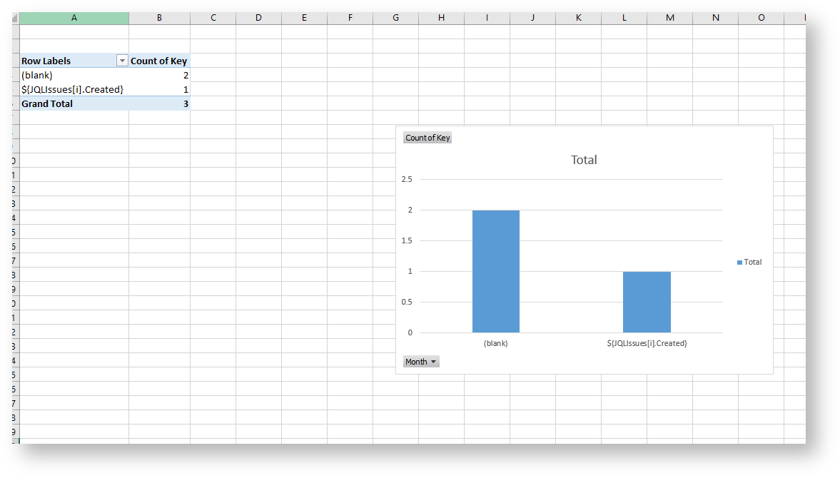
We are going to create a pivot table.
A pivot table allows you to extract the significance from a large, detailed dataset.
- To create a pivot table click on the first cell inside the header.
- On the Insert tab, click PivotTable
- A Dialog box appears. Excel automatically selects the data for you. The default location for a new pivot table is the New Worksheet.
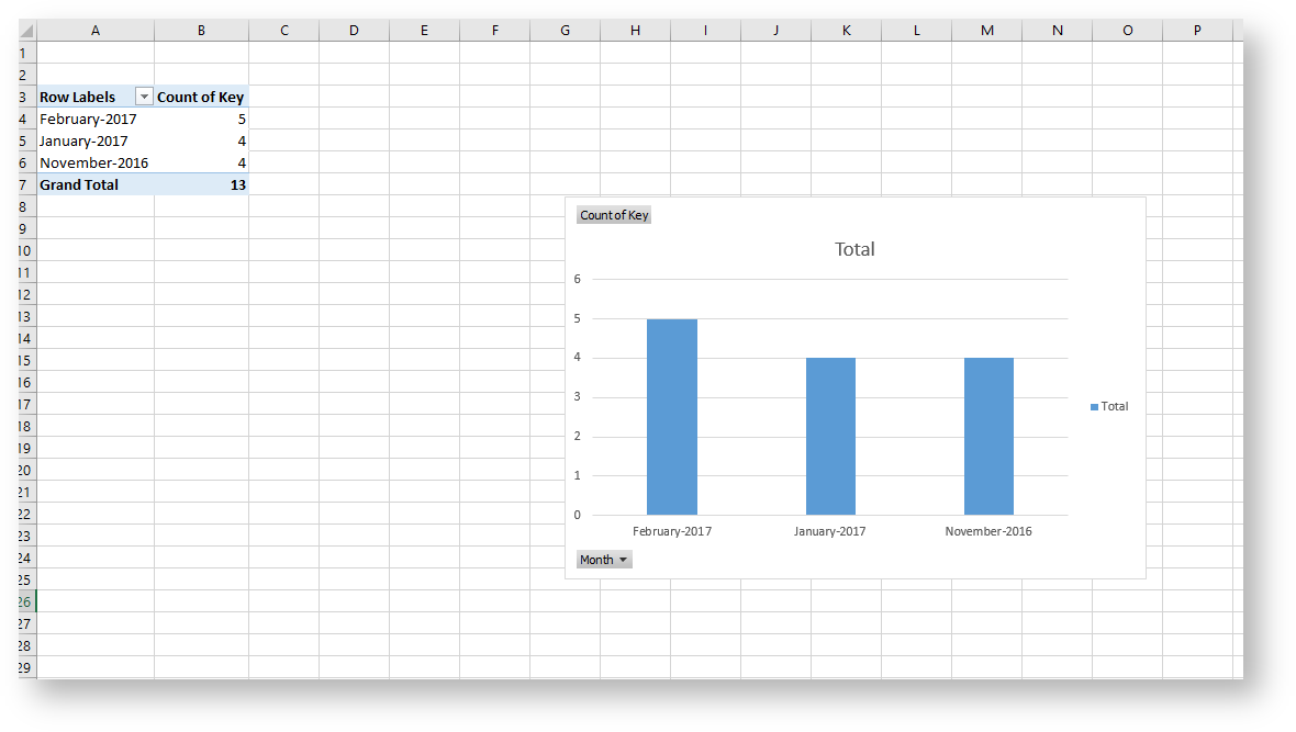
- Click ok. The second sheet was created. Rename it to "Chart by Month".
Now, The PivotTable fields list appears.
- The Field Month we are going to drag on the Rows.
- The Key we are going to drag on the Values.
The configuration of the pivot table is done but we are going to add a chart.
- Select all pivot table.
- On the Insert tab, click charts. You can pick up all chart. In this case, I am going to choose the 2-D Column.
- The chart appears on the sheet.
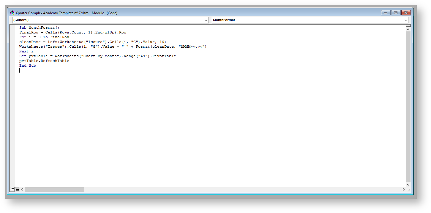
We are going to use the Macros to set up the Month field.
Go to View -> Macros -> View Macros. In Macros in: select This Workbook. Name the macro "MonthFormat" and click Create.
A new window appears to insert the VBA code. In the created module, insert the following code:
Sub MonthFormat() FinalRow = Cells(Rows.Count, 1).End(xlUp).Row For i = 3 To FinalRow cleanDate = Left(Worksheets("Issues").Cells(i, "G").Value, 10) Worksheets("Issues").Cells(i, "G").Value = "'" + Format(cleanDate, "MMMM-yyyy") Next i Set pvtTable = Worksheets("Chart by Month").Range("A4").PivotTable pvtTable.RefreshTable End Sub |
When you have a template that only contains a JQL query or a JQL iteration, as in this case, you can export it straight from the menu Xporter Reports.
After exporting, you should go to View -> Macros -> View Macros and run the MonthFormat macro.
Below there is a sample of how the mappings will be displayed in an Excel template:
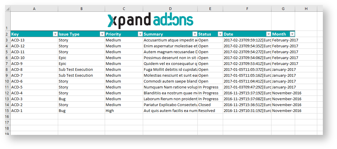
Below there is a sample of how the generated file will be populated:
If you like this exercise, please share your opinion on the page by just leaving a comment or a ![]() . Your opinion is very important to us.
. Your opinion is very important to us.
Thank you in advance.
Enjoy our product. ![]()