In this exercise, you'll learn how to populate the Issue time tracking from some issues with pivot tables on a Xporter generated file.
This template is going to have two sheets.
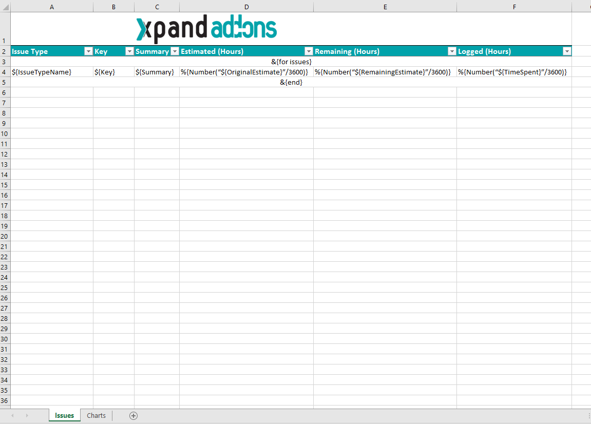
Let's create the first sheet. If you want to display the header you must create the Header using a table with 6 columns and 1 row:
| Issue Type | Key | Summary | Estimated (Hours) | Remaining (Hours) | Logged (Hours) |
|---|
Since all the table contents below the Header are dynamic, firstly we need to create a single row Table to be the Header, and below add the &{for issues...} statement, so the Header is printed only one time.
On this case is a template on Excel, so don't forget the note below.
Using an XLSX template, please take note that to define an iteration for multiple columns, you need to merge a row of columns and define the &{for issues...} inside that merged cells. The same thing should be made to define the &{end} of the same iteration. All content between the &{for issues...} definition and the &{end} will be duplicated for each iteration.
With that done, you create another row table where the Issue Comments will be populated:
${IssueTypeName} | ${Key} | ${Summary} | %{Number(“${OriginalEstimate}”/3600)} | %{Number(“${RemainingEstimate}”/3600)} | %{Number(“${TimeSpent}”/3600)} |
Now close the statement using the mapping &{end}.
Finally, we need to give filters to the headers of the table in order for the table to work with the pivot tale. To do this, Select the first cell of the header ("Issue Type"), find the "Sort & Filter" options, and select "Filter".
Well, the first sheet is complete, extracting all the data we need. Let´s go to the second sheet.
We are going to create a pivot table.
A pivot table allows you to extract the significance from a large, detailed dataset.
- To create a pivot table click on the first cell inside the header ("Issue Type").
- On the Insert tab, click PivotTable
- A Dialog box appears. Excel automatically selects the data for you. The default location for a new pivot table is the New Worksheet.
- Click ok. The second sheet was created.
Now, The PivotTable fields list appears.
- The Field Key we are going to drag on the Rows.
- Estimated (Hours) we are going to drag on the Values.
- The Remaining (Hours) and Logged (Hours) are also going to Values.
- For each Estimated (Hours), Remaining (Hours) and Logged (Hours) on the Values, we are going to set up a configuration:
- Click on Value Field Settings.
- In Choose the type of calculation you want to use. We are going to use the Sum.
- Click ok.
- Right-click the pivot table and select PivotTable Options
- Select tab Data
- Check Refresh data when opening the file.
The configuration of a pivot table is done but you are going to add a chart.
- Select all pivot table.
- On the Insert tab, click charts. You can pick any chart. In this case, I am going to choose the 2-D Column.
- The chart appears on the sheet.
To display only once both table and chart, you can filter the issues iteration with:
| &{for issues|filter=%{'${BulkIssueIndex}' == 0}} |
You'll have to close the code above with &{end} on the cell below the chart.
Below there is a sample of how the mappings will be displayed in an Excel template:
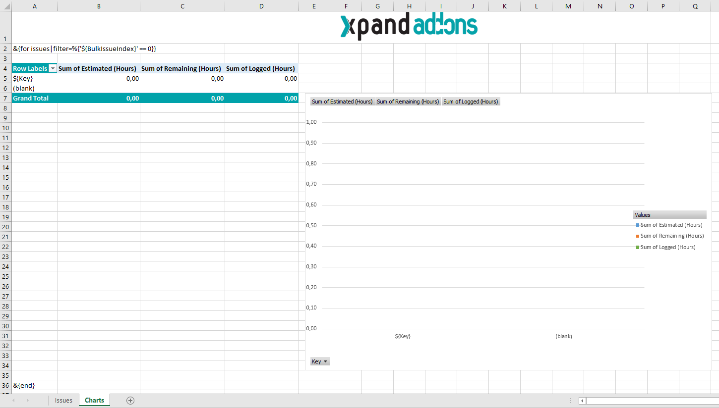
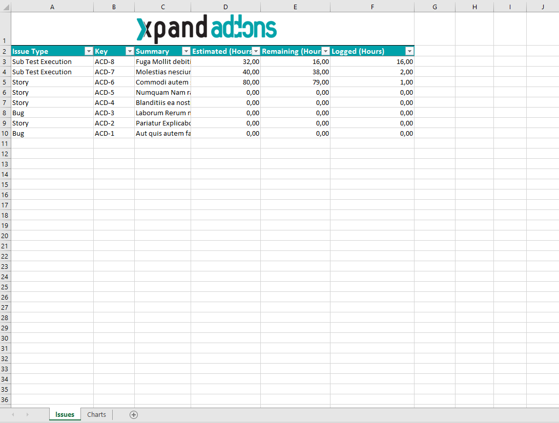
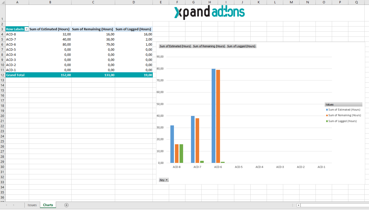
Below there is a sample of how the generated file will be populated:
If you like this exercise, please share your opinion on the page by just leaving a comment or a ![]() . Your opinion is very important to us.
. Your opinion is very important to us.
Thank you in advance.
Enjoy our product. ![]()